GIT 542 — UX Case Study
Nyland
Cohousing
Website Redesign
A full-cycle UX project for a real client — from heuristic evaluation and usability testing to high-fidelity redesign.
Course
GIT 542 — Usability & UX
Timeline
Spring 2026 Semester
Team
Nyland B Team · 6 members
Methods
Heuristic · Survey · Usability Test
— Project Overview
What is this about?
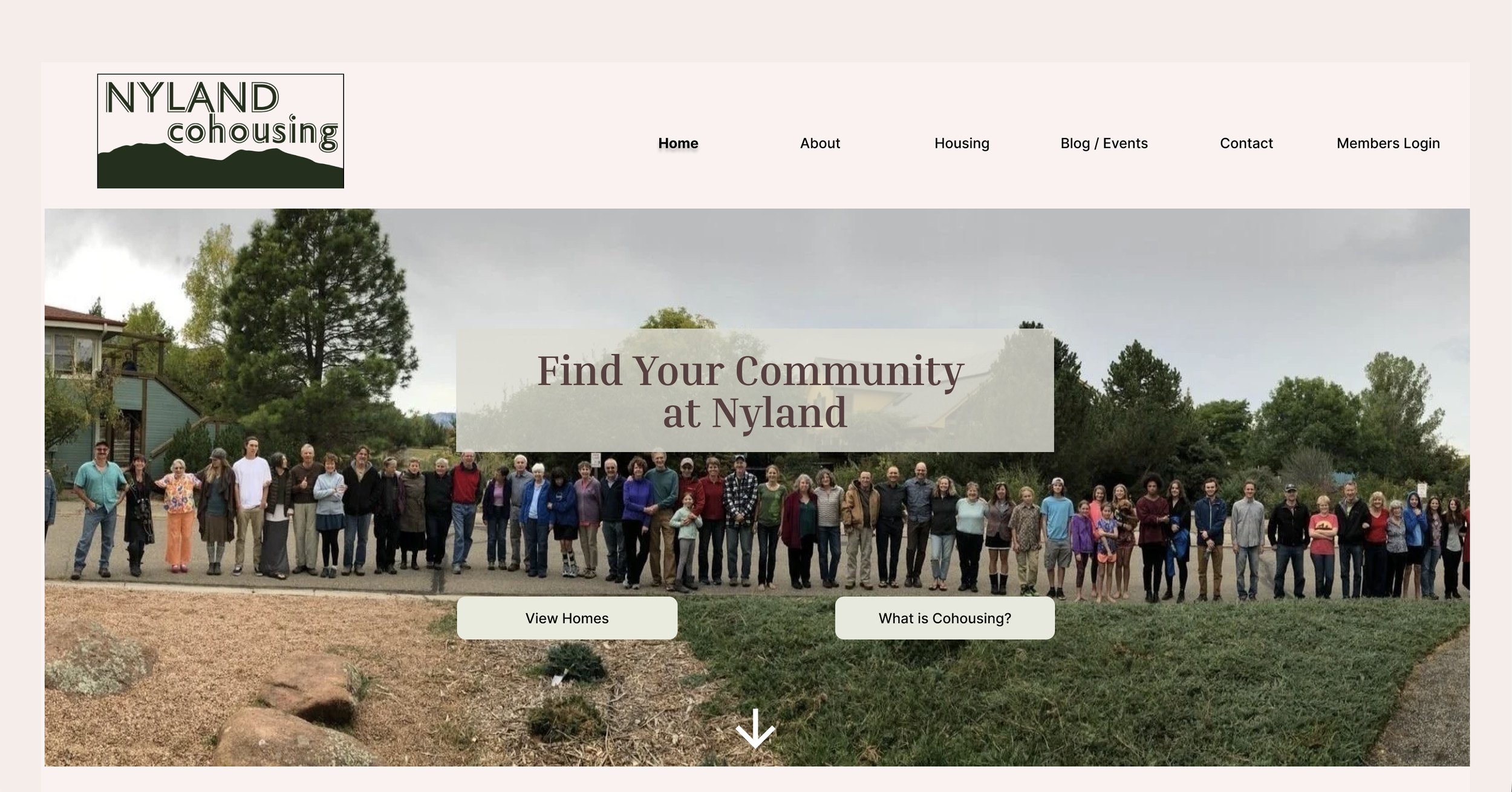
Nyland Cohousing is an intentional community in Lafayette, Colorado. Their website — nylandcohousing.org — serves both current residents and prospective members. Our team was tasked with a comprehensive usability evaluation of the site.
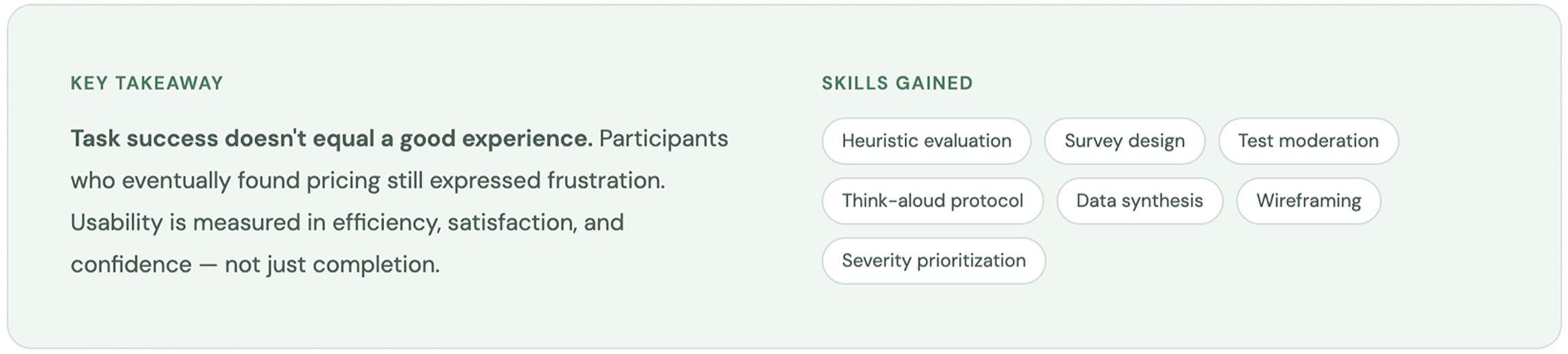
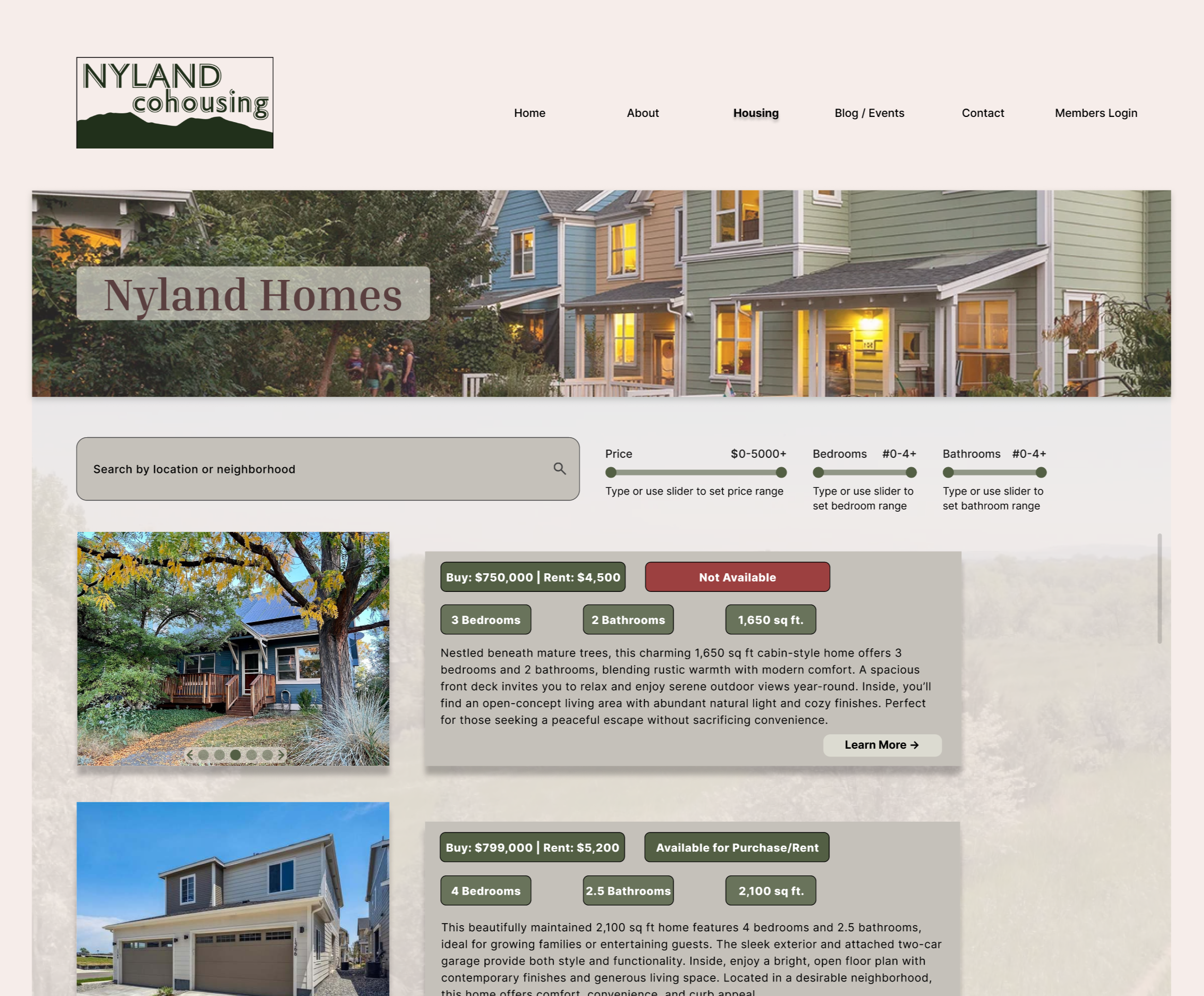
The central problem: first-time visitors couldn't quickly understand what cohousing is, couldn't find housing pricing, and couldn't see evidence of an active community — all critical decision-making factors.
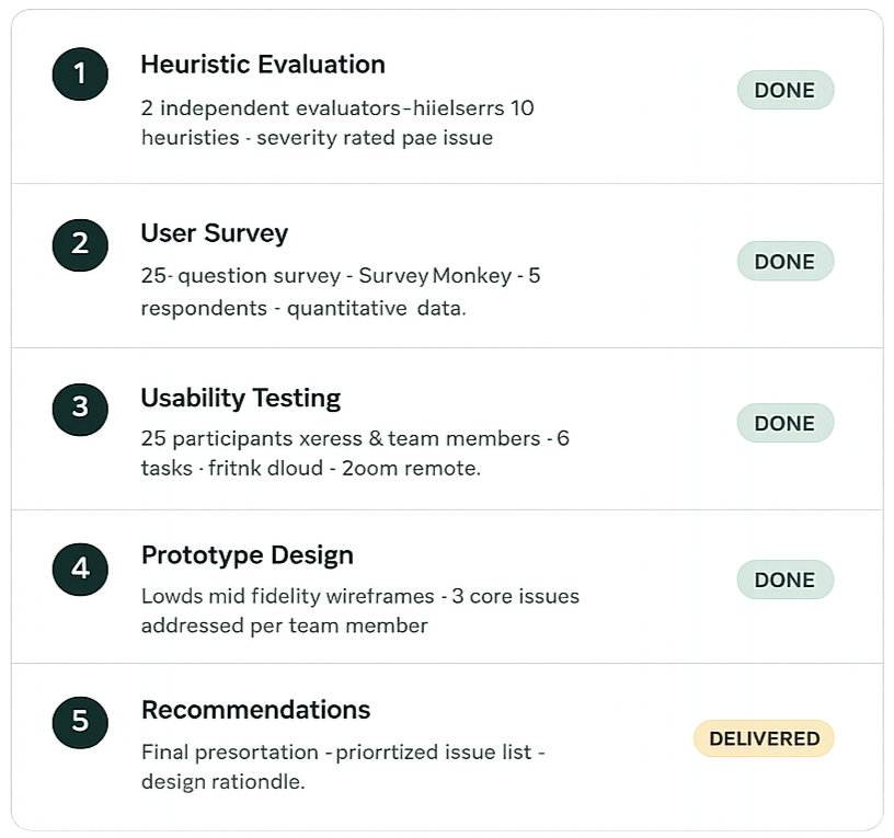
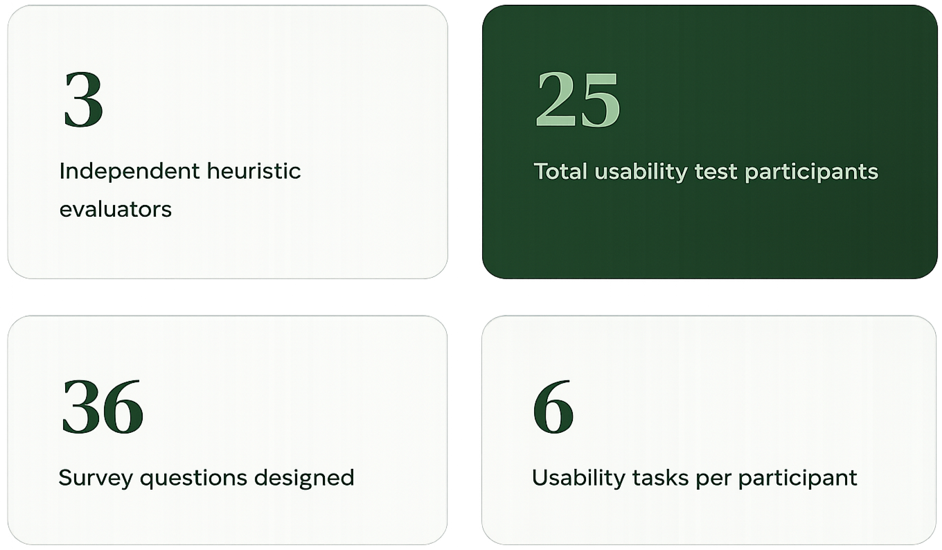
Over a full semester, the team conducted independent heuristic evaluations, a user survey, remote usability tests with 25 real participants, and produced wireframe prototypes addressing the top findings.
My role: Full participation across all phases — heuristic evaluation, survey design, usability test moderation, data analysis, prototype design, and final presentation.

— Phase 1 — Heuristic Evaluation
Expert review of the existing site
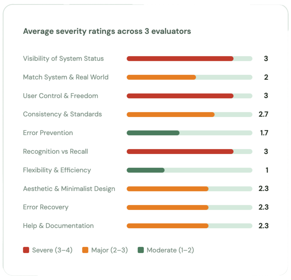
Each team member independently evaluated the site against Nielsen's 10 usability heuristics, using Jeff Rubin's severity scale (1–4).

Evaluated by:
Top findings

No active page indicator
No highlighted nav states or breadcrumbs — users couldn't tell which page they were on. All 3 evaluators flagged as severity 3–4.Cohousing concept buried
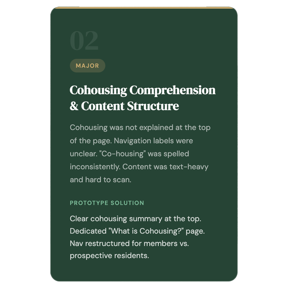
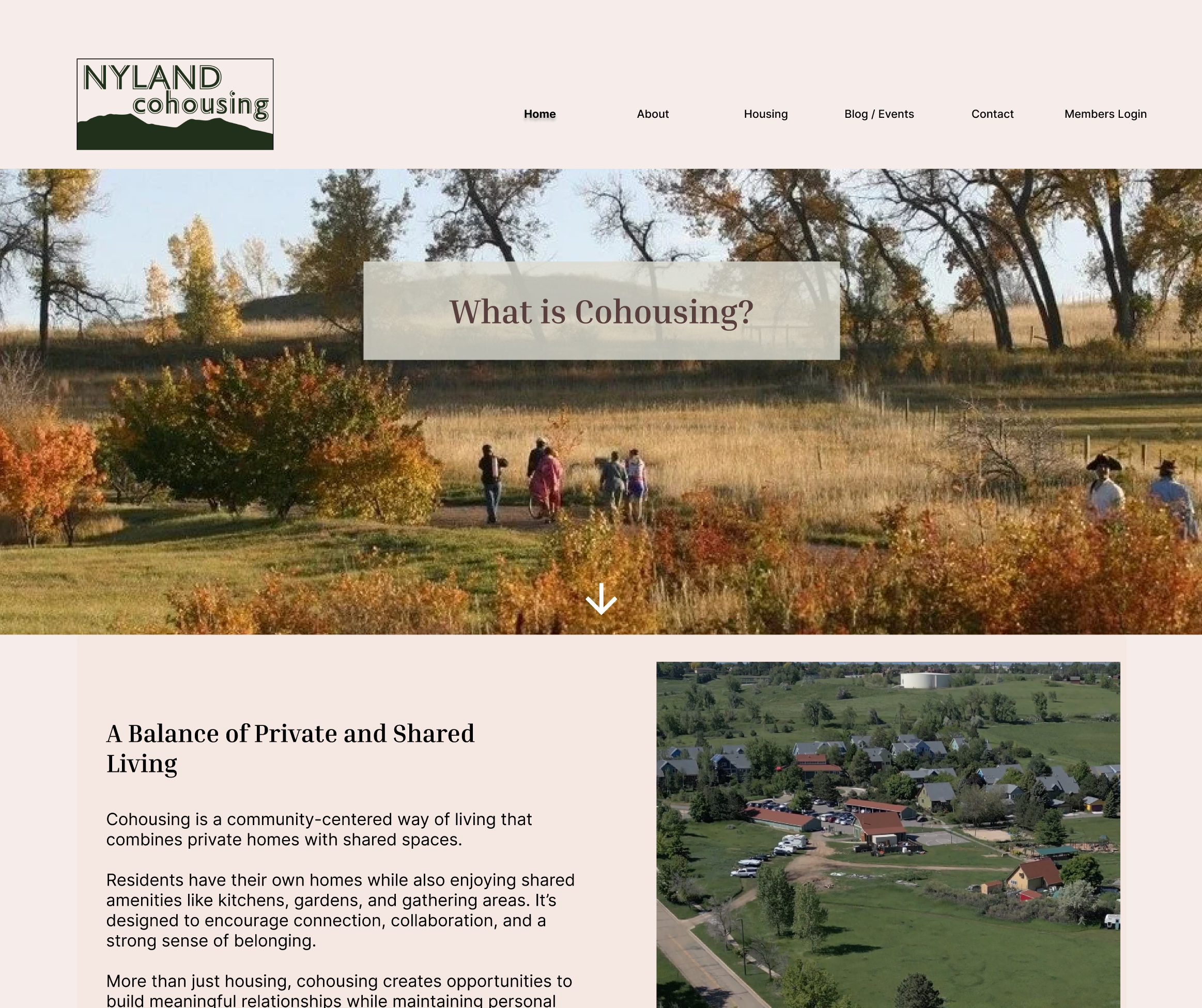
The site assumes visitors already know what cohousing is. Explanation appeared below values and vision content, requiring scrolling to find.
Navigation inconsistency
Logo click-to-home broke on password-protected pages. Only 3 nav buttons, missing key sections like gallery, events, and news.Dense, unbalanced content
Multiple pages had walls of text with no accompanying visuals, making scanning difficult. "Co-housing" also spelled inconsistently throughout.
Calm visual style appreciated
Nature-inspired aesthetic and color palette were appropriate. Text was readable across all evaluators.— Phase 2 — User Survey
Quantitative user research
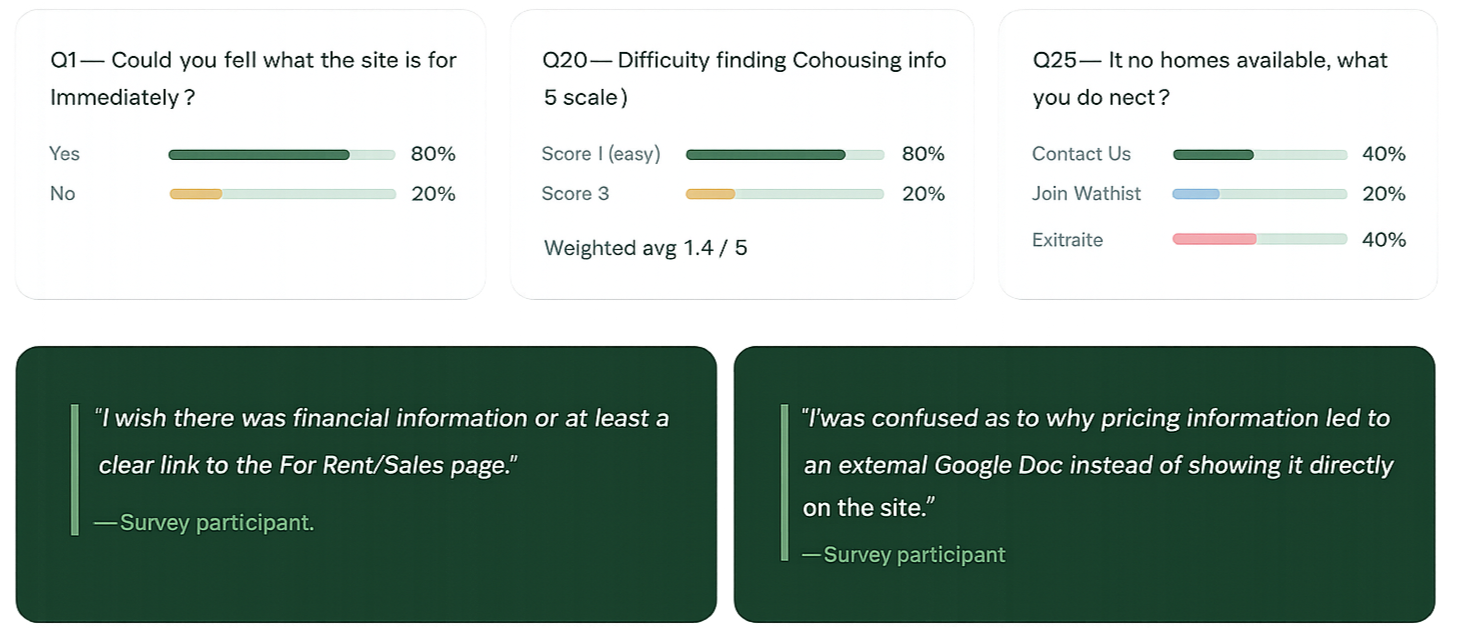
A 36-question survey deployed via SurveyMonkey, with 5 participants recruited through the ASU GIT class.
— Phase 3 — Usability Testing
Testing with real users
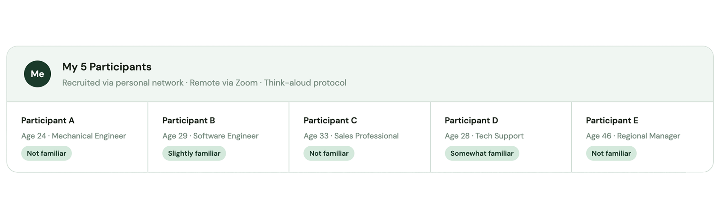
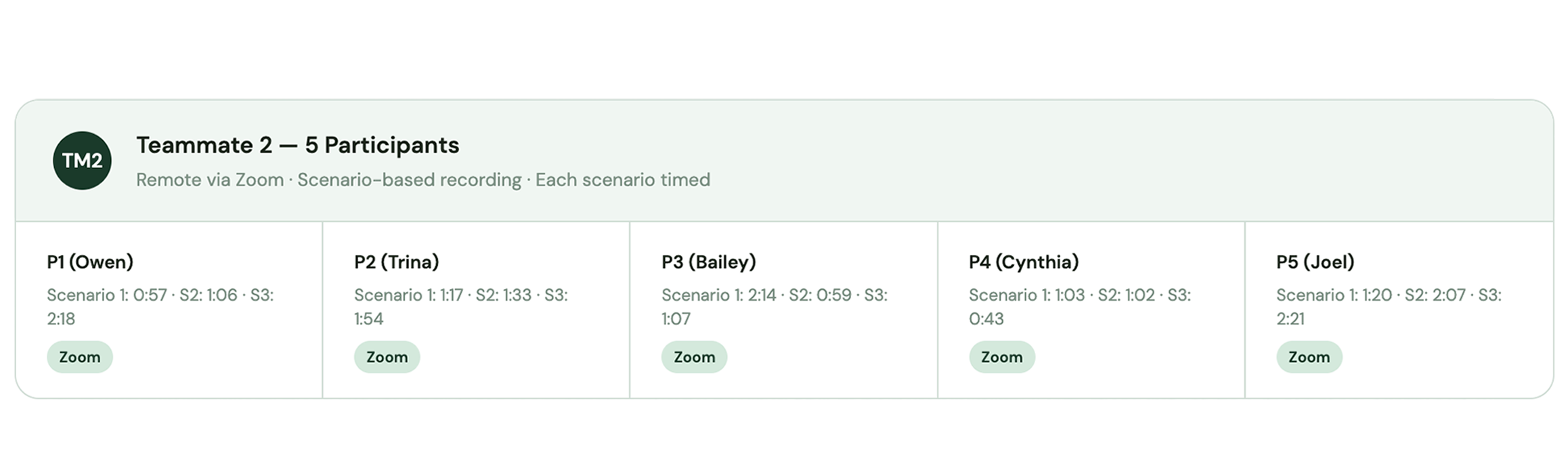
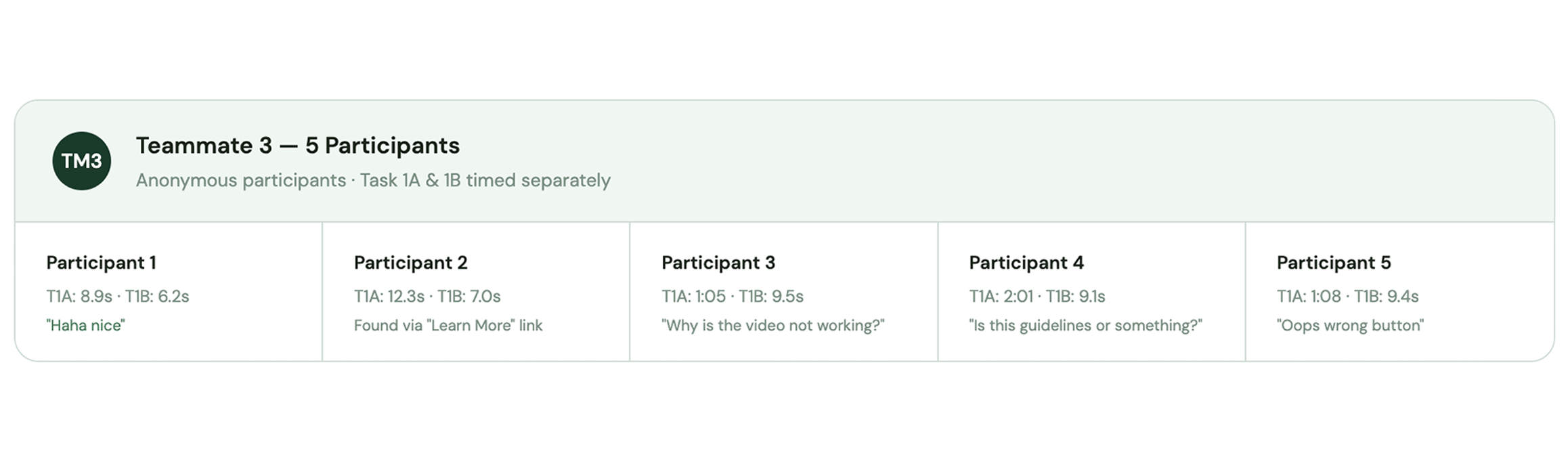
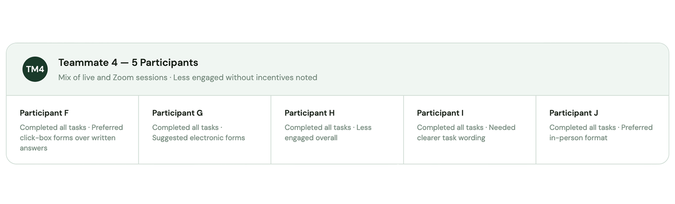
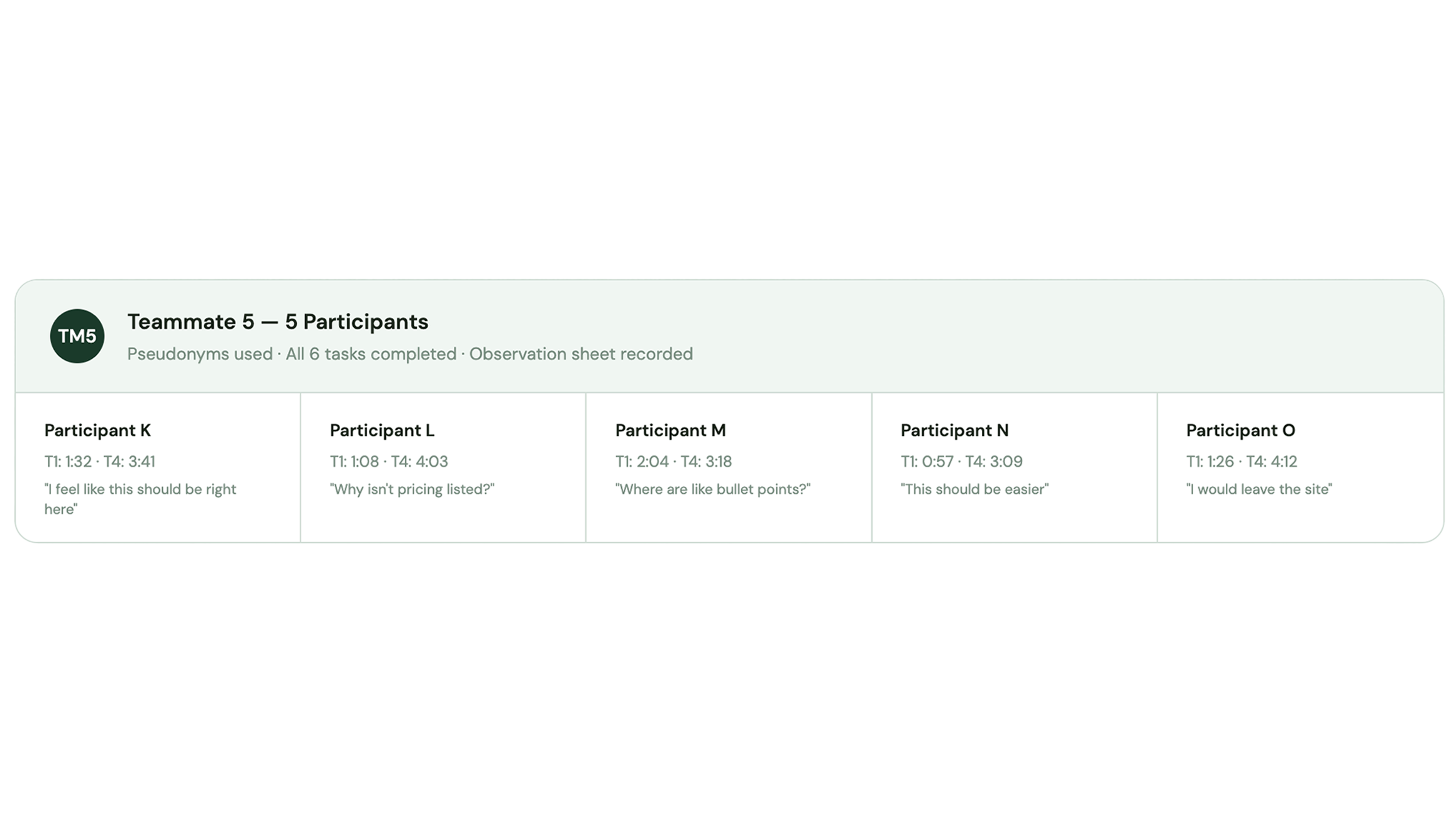
Each team member recruited 5 participants and conducted remote usability tests via Zoom using a shared test plan, script, and observation sheet. All 25 participants completed 6 tasks with think-aloud protocol. Names below are pseudonyms to protect participant privacy.
Consolidated task difficulty across all 25 participants
Task
T1 — Find what cohousing is
T2 — Find a community value
T3 — Find homes information
T4 — Find pricing / financial info
T5 — Find community events
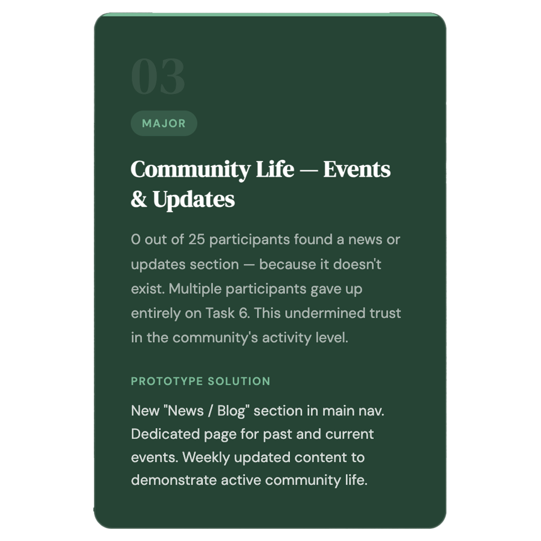
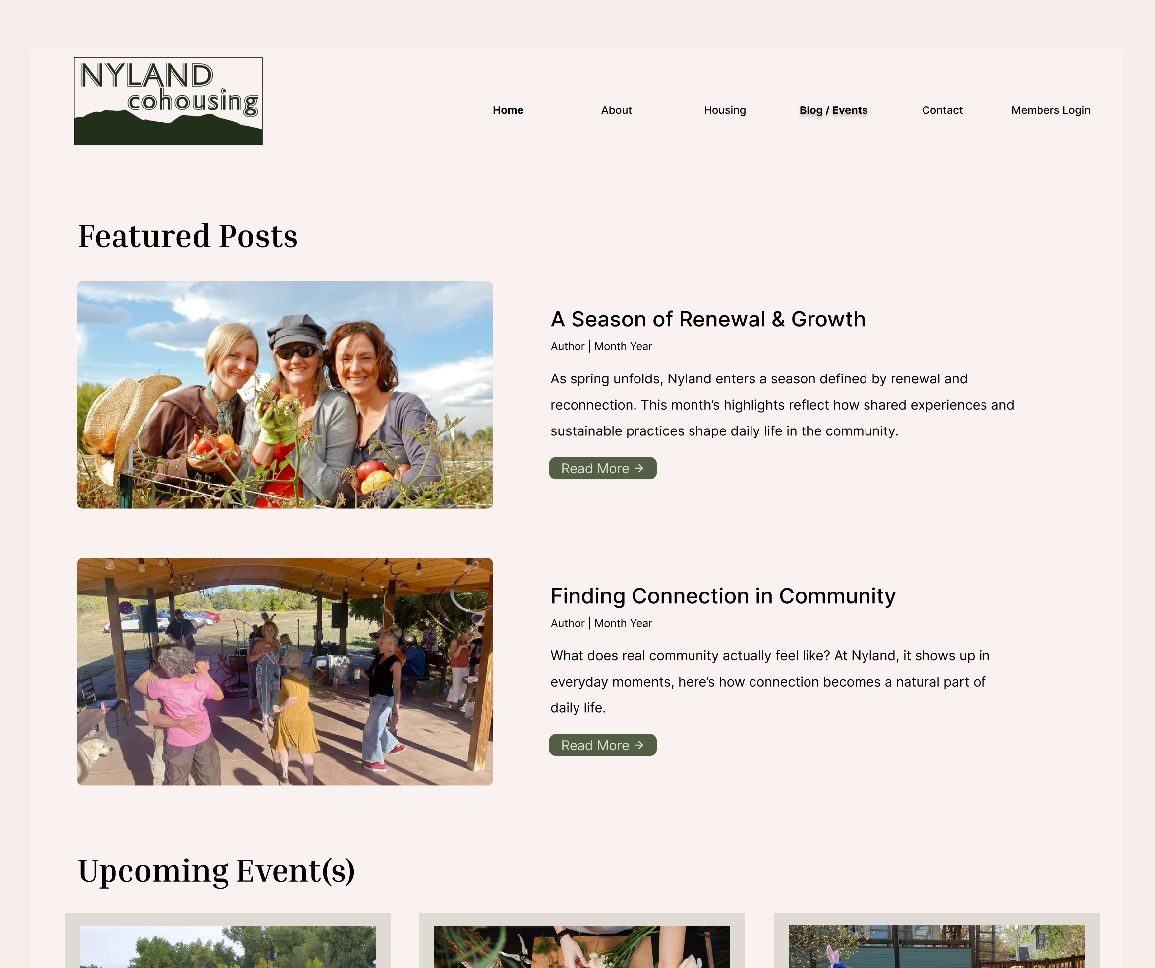
T6 — Find updates / news
AVG Time (MY 5)
T1 — ~0:46
T2 — ~0:36
T3 — ~0:44
T4 — ~1:14
T5 — ~0:28
T6 — 0 / 5 success
CROSS-TEAM PATTERN
T1 — Text-heavy; took longer for unfamiliar users (up to 2:04)
T2 — Consistently fast; values section was well-structured
T3 — Generally easy; users engaged positively with homes section
T4 — Biggest friction — up to 4:12; multiple users said they'd exit
T5 — Mixed — some found partial info; no clear events page exists
T6 — All teams: users checked footer; section doesn't exist

— Phase 4 — Core Findings
3 prioritized issues
Synthesized from all three research phases — heuristic evaluation, survey results, and 25 usability test sessions.

High-Fidelity Redesign
— Phase 5 — Prototype Design

The team iterated from low-fidelity wireframes through to a fully interactive Figma prototype — directly addressing the 3 prioritized issues identified in testing.
Final deliverable
Interactive Figma Prototype
The team's final prototype is fully interactive — click through the complete user flow addressing all 3 prioritized issues: cohousing comprehension, housing pricing visibility, and community updates.

Figma prototypes cannot be embedded — click the screens below or use "Open in Figma" to interact with the full prototype.

Issue 1 — Blocker
Housing & pricing visibility
Pricing on listing cards · Waitlist redirect · Contact pop-up

Issue 2 — Major
Cohousing comprehension
Summary at top · Dedicated explainer page
· Restructured nav

Issue 3 — Major
Community life & updates
News / Blog in nav · Events page · Weekly updates
— Phase 6 — REFLECTION

What I learned
What went well
Think-aloud protocol was highly effective — hearing participants verbalize their reasoning revealed issues that observation alone would miss.
All 5 of my participants completed all 6 tasks, confirming the site is navigable despite its issues.
Participants engaged most strongly with community content (Activities section), giving rich qualitative insight into user priorities.
Running the full cycle — heuristic → survey → usability test → prototype — gave a complete picture of where the site fails and why.
Independent evaluations from 3 team members significantly reduced individual bias in the heuristic phase.
Running a full UX research cycle from expert review through prototype design gave me hands-on experience with every stage. Here's an honest reflection.

What I'd do differently
Run a pilot test before actual sessions to catch unclear task wording — participants sometimes interpreted tasks differently than intended.
Record each task separately rather than each scenario, for more precise timing data and cleaner comparisons.
Provide a more thorough warm-up for the think-aloud method — some participants were initially quiet.
Recruit more diverse participants, particularly older users and people actively searching for housing, to better match real target users.
Add brief follow-up questions between tasks to distinguish site confusion from task wording confusion.