PROJECT MUSE AI
— Mobile App Design
Designing an intelligent AI companion that thinks, listens, and adapts with you.
Project Title: Project Muse AI (PMA)
Duration: 3 Months
Role: UX/UI Designer (End-to-End)
Independently led the project from user research to high-fidelity design and testing
Project Vision
Most AI apps today are powerful, but not intuitive.
Through user interviews, I found that people often feel confused, overwhelmed, and unsure how to interact with AI — especially during onboarding and conversation flow.
This project explores how to design an AI assistant that feels clear, trustworthy, and easy to use from the very first interaction.
To achieve this, I focused on simplifying navigation, improving system feedback, and reducing cognitive load across key user flows — including onboarding, chat, and content discovery.
1. Designing for Light and Dark Mode
Ensuring consistency and readability across both themes required careful color and component planning.
I chose to design both themes in parallel from the beginning, prioritizing contrast and visual hierarchy over purely aesthetic differences to maintain usability in all conditions.
2. Making AI Conversations Feel Natural
AI chat interfaces often feel mechanical and difficult to follow.
To address this, I simplified message structures and introduced clearer system feedback, prioritizing clarity and predictability over expressive but inconsistent interactions.
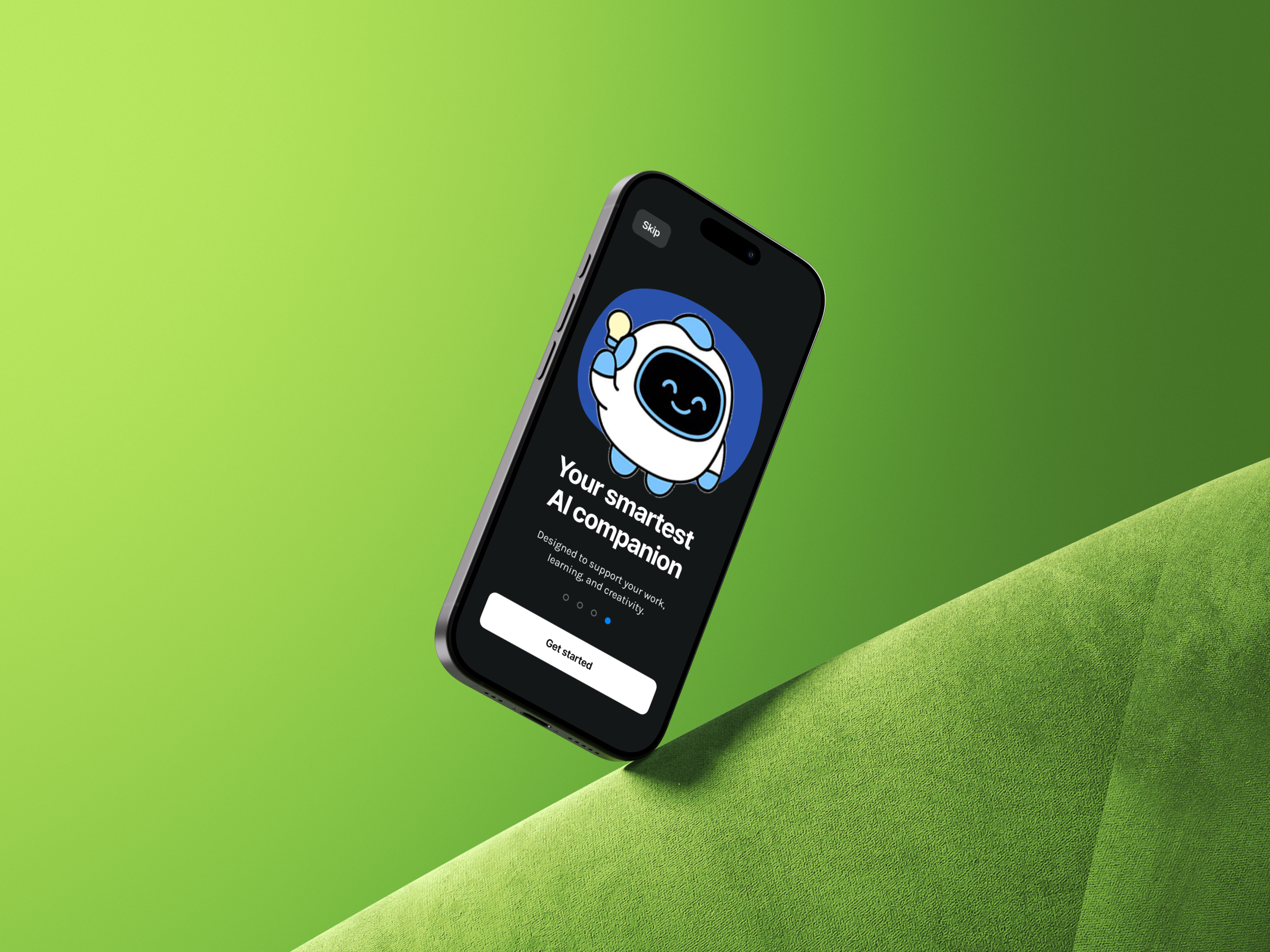
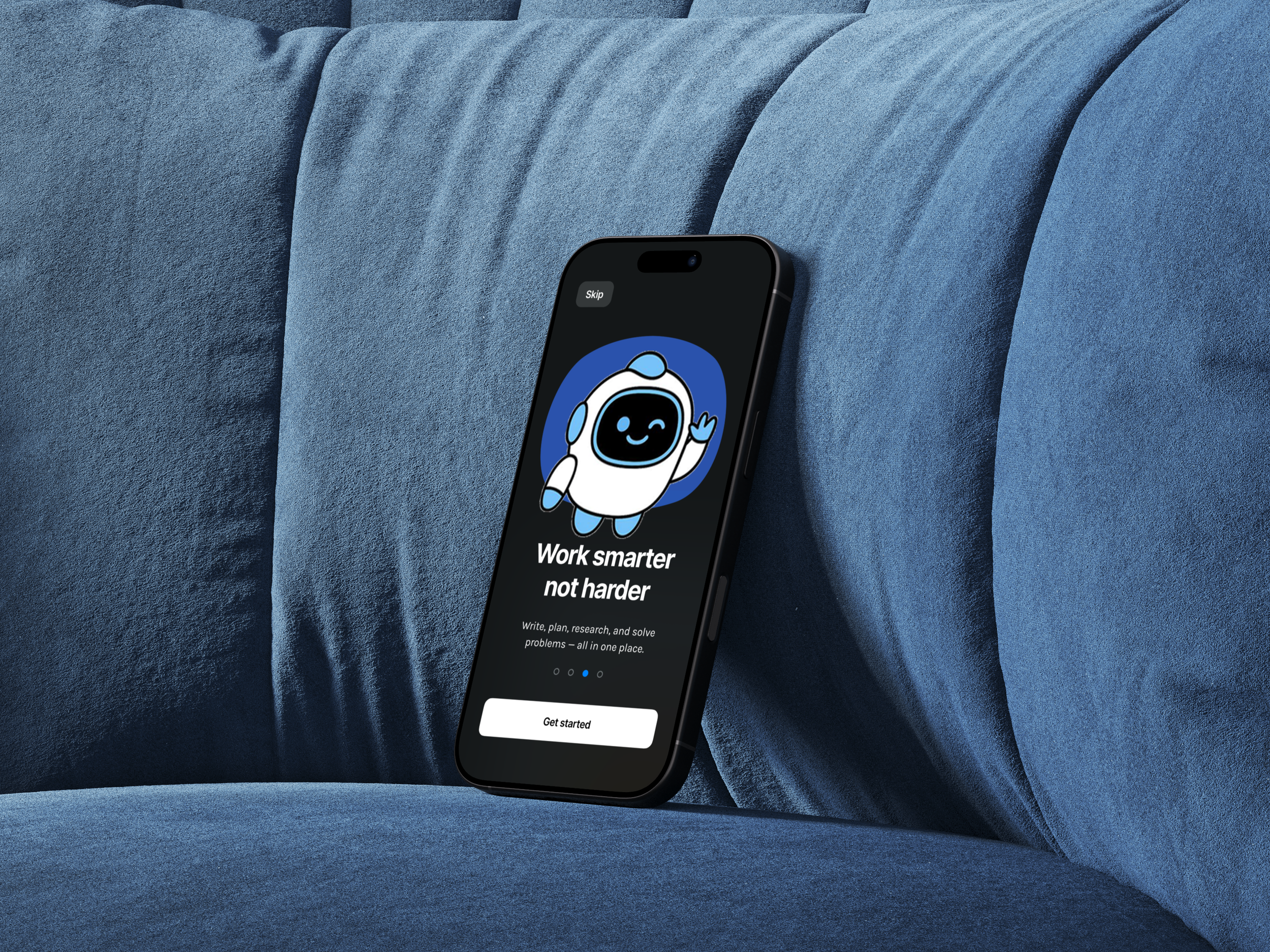
3. Onboarding Without Friction
First-time users often feel uncertain about how to interact with AI tools.
I focused on reducing onboarding steps and introducing guided prompts, prioritizing immediate usability over feature exposure.
4. Balancing Feature Depth and Simplicity
The app includes multiple modules such as Chat, Search, and Settings, which can easily overwhelm users.
I simplified navigation and reduced visible options, prioritizing ease of use over full feature visibility.
Challenges
Kickoff
This project started from a personal question: what would a truly well-designed AI assistant app look like?
With no existing template or brief, I began by researching real AI apps — studying how tools like ChatGPT, Claude, and Perplexity handle conversation flow, navigation, and onboarding.
I conducted interviews with 8 participants across different industries and age groups to understand their real frustrations with existing AI tools. Their feedback revealed consistent patterns around discoverability, trust, and personalization that became the foundation for every design decision in Project Muse AI.
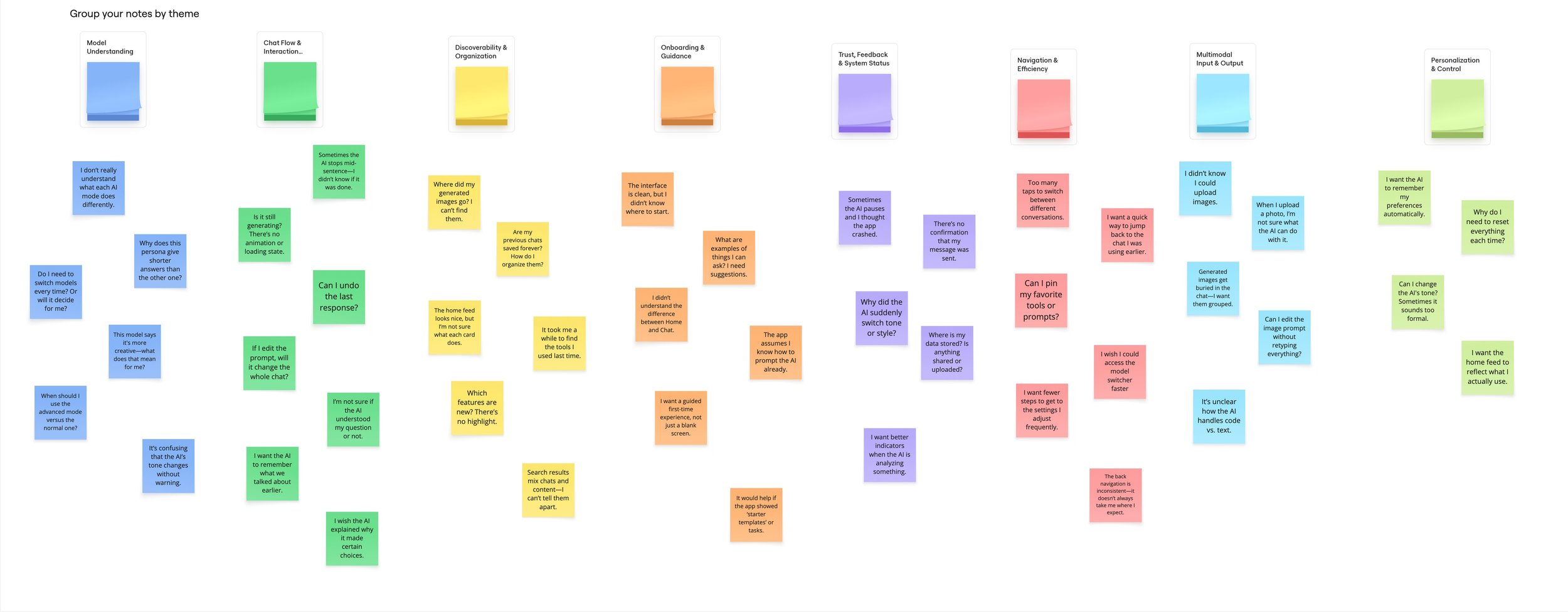
After interviewing all 8 participants and synthesizing the findings into an affinity diagram, I identified 8 key research themes:
Model Understanding — Users didn't know what different AI models could do or when to switch between them.
Chat Flow & Interaction — People were confused about editing messages, undoing responses, and what happens mid-conversation.
Discoverability & Organization — Users couldn't find previous chats, generated images, or features they had used before.
Onboarding & Guidance — First-time users didn't know where to start and wanted guided examples or starter templates.
Trust, Feedback & System Status — Users were unsure if their message was sent, if the AI was still generating, or why it suddenly changed tone.
Navigation & Efficiency — Too many taps to switch conversations or reach frequently used settings frustrated regular users.
Multimodal Input & Output — Users were unclear about uploading images, editing prompts, and how the AI handled code versus text.
Personalization & Control — People wanted the AI to remember their preferences and reflect how they actually use the app — without resetting every session.
Understanding the Problem
Meet the Users
Yiqun Valerio He Age: 24 | Mechanical Engineer Uses AI for technical problem-solving and documentation. Wants precise, reliable responses and gets frustrated when the AI changes tone unexpectedly or doesn't remember previous context.
Rita Zhang Age: 29 | Software Engineer A power user who relies on AI daily for code review and debugging. Needs multimodal input support and clear visual feedback when the AI is processing complex requests.
Yuliana Arias Age: 33 | Dental Sales Representative Uses AI occasionally to draft emails and prepare for client meetings. Values a clean, approachable interface and needs onboarding that clearly explains what the app can do.
Jonathan Phu Age: 28 | Tech Support Specialist Switches between multiple AI tools depending on the task. Wants faster navigation, fewer taps, and a way to pin frequently used prompts or conversations.
Michelle Chen Age: 46 | Regional Sales Manager A busy professional who uses AI in short bursts throughout the day. Needs the app to feel intuitive without a learning curve — clear status indicators and quick access to recent chats are essential.
Louis Liu Age: 26 | Tech Support Specialist Explores AI tools out of curiosity and for work efficiency. Cares about discovering new features and wants the interface to highlight what's new without requiring him to search for it.
Joy Zhong Age: 31 | Regional Sales Manager Uses AI to prepare reports and presentations. Gets frustrated when generated content disappears or is hard to find again. Wants better organization of outputs and saved conversations.
Tanaka Teruyuki Age: 27 | Nursing Student Accesses AI for study support and research. Needs a guided first-time experience and wants the AI to feel trustworthy — especially when asking health-related or academic questions.
Before moving to visual design, I mapped out the full user flow — from the first launch screen through onboarding, login, home, chat, search, and settings. This helped me identify where friction could appear and where the experience needed to feel most effortless.
Key flows mapped:
Onboarding → Login (first-time user entry)
Home → Chat (primary daily use)
Search (finding past conversations or content)
Notifications → Chat (re-engagement flow)
Settings (account, preferences, and customization)
Preparing the Journey
For Project Muse AI, I designed a visual system that feels modern, intelligent, and approachable — reflecting the dual nature of AI: powerful yet personal.
Color — The palette features deep navy, electric blue, and clean white as primary tones. Blue signals intelligence and trust; dark backgrounds in the dark theme create focus and reduce distraction.
Typography — A clean sans-serif typeface supports readability across all screen sizes. Bold headers anchor key sections, while lighter body text keeps content easy to scan.
Components — Chat bubbles, input fields, navigation bars, and notification cards are all designed with consistent corner radii and spacing — ensuring the interface feels cohesive across every screen.
Light & Dark Themes — Both themes were designed in parallel from the start, ensuring every component works beautifully in either environment without compromise.
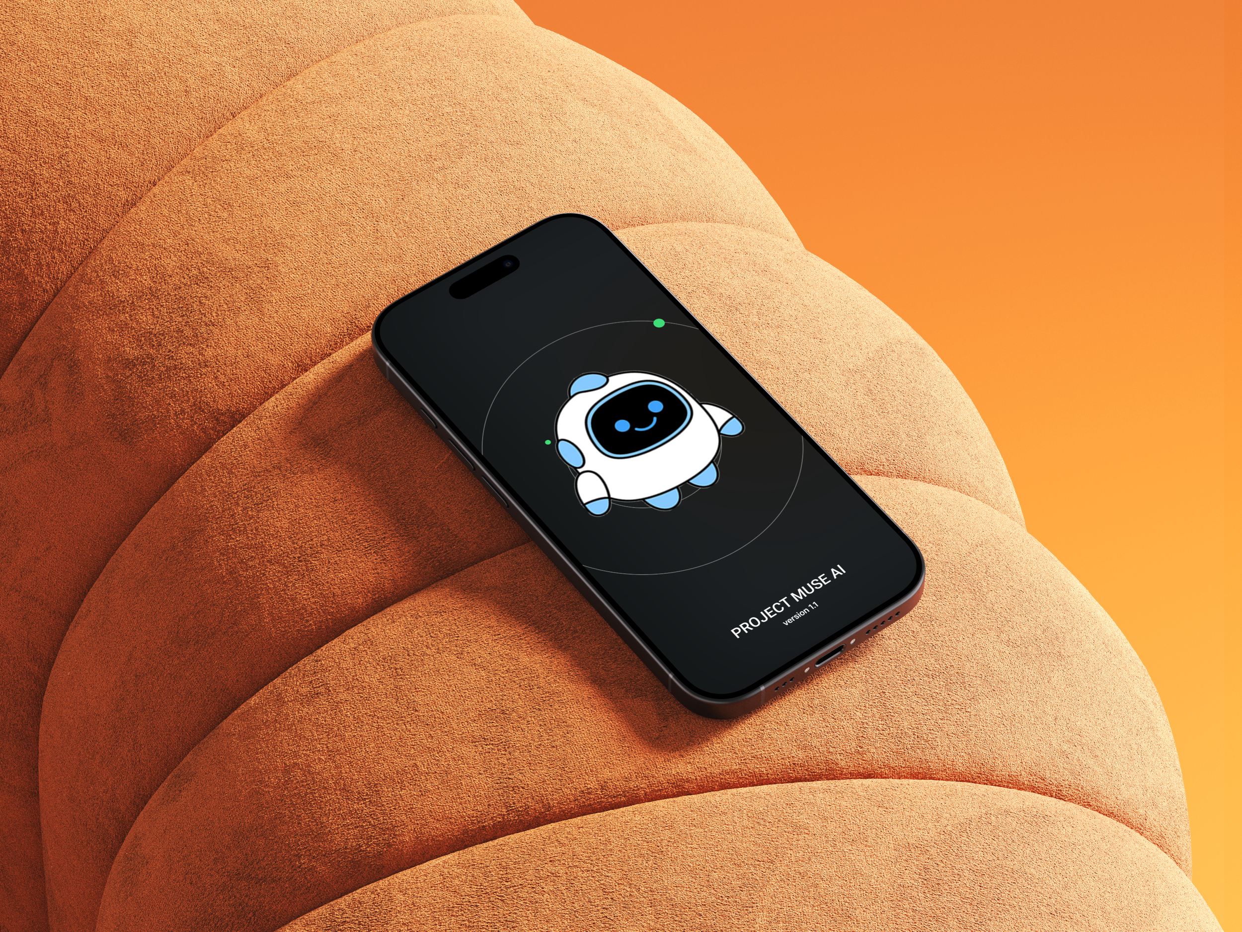
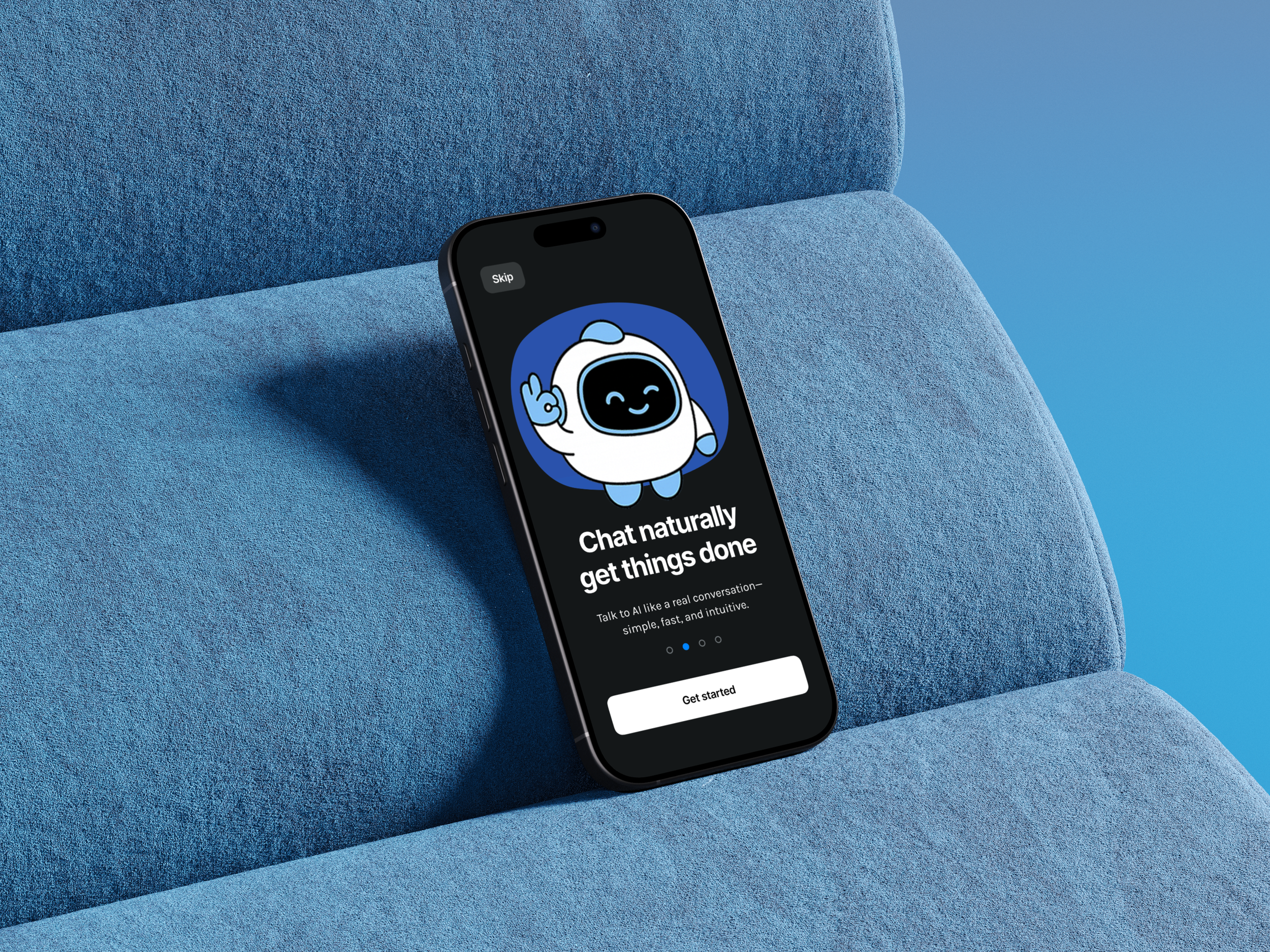
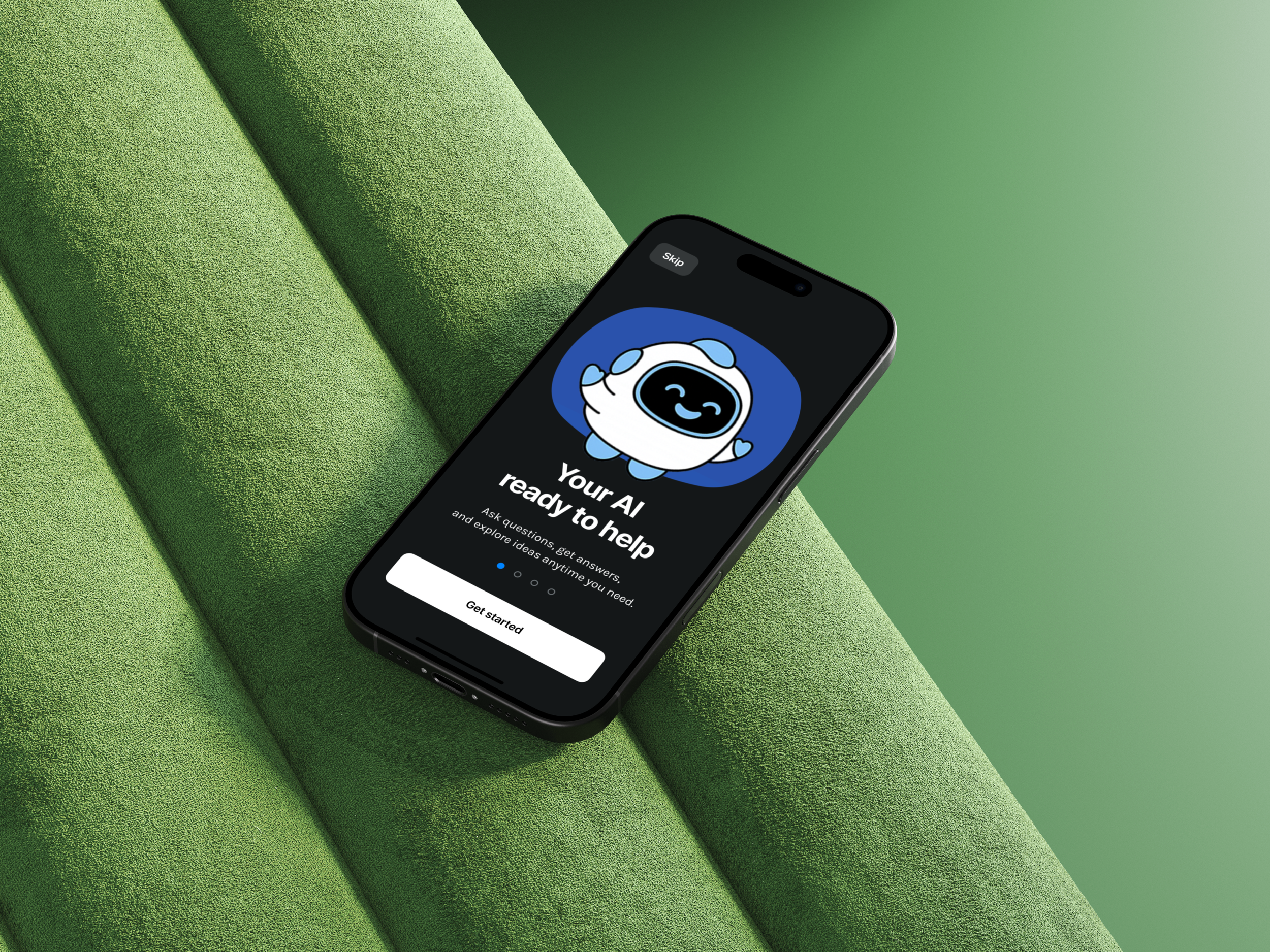
Mascot — The PMA robot character appears throughout onboarding, adding personality and making the AI feel less like a tool and more like a companion.
Style Guide
For Project Muse AI, I designed a visual system that feels modern, intelligent, and approachable — reflecting the dual nature of AI: powerful yet personal.
Color — The palette features deep navy, electric blue, and clean white as primary tones. Blue signals intelligence and trust; dark backgrounds in the dark theme create focus and reduce distraction.
Typography — A clean sans-serif typeface supports readability across all screen sizes. Bold headers anchor key sections, while lighter body text keeps content easy to scan.
Components — Chat bubbles, input fields, navigation bars, and notification cards are all designed with consistent corner radii and spacing — ensuring the interface feels cohesive across every screen.
Light & Dark Themes — Both themes were designed in parallel from the start, ensuring every component works beautifully in either environment without compromise.
Mascot — The PMA robot character appears throughout onboarding, adding personality and making the AI feel less like a tool and more like a companion.
Style Guide
Designing Project Muse AI over three months taught me what it truly means to build a product from nothing. Without a brief or a team, every decision had to be justified through research and real user feedback.
Interviewing 8 participants across completely different industries — from nursing students to sales managers to engineers — showed me how differently people think about AI. There is no single "AI user." Good design has to work across all of them.
I also learned that trust is the most important thing to design for in an AI product. When users don't know if the app is working, if their message was received, or what the AI can actually do — they leave. Every status indicator, every loading state, every confirmation screen is a trust-building moment.