LUMA Museum – Website Concept Design
Project Title: LUMA Museum – Website Concept Design
Role: UX Designer (Research, Sitemap, Wireframe, Visual Design)
Duration: 4 weeks
Creating a digital museum experience that informs and inspires.
Project Vision
The goal of this project was to design a website for LUMA Museum from the ground up. Based on research insights, the primary objectives were to:
Create a user-friendly digital experience that showcases the museum’s mission and collections.
Make educational content more accessible and engaging for different audiences—families, students, and educators.
Establish a clear structure for membership, donations, and events to support the museum’s growth.
Ensure inclusive access through thoughtful information architecture and accessibility considerations.
Challenges
Designing a website from scratch for a cultural institution like LUMA Museum came with several key challenges:
Undefined Information Architecture: With no existing site structure, it was challenging to organize diverse content (about, education, membership, etc.) in a way that was intuitive and easy to navigate.
Balancing Audiences: The site needed to appeal to a broad range of users—families, educators, students, and potential members—each with different needs and expectations.
Limited Visual Identity: With minimal brand guidelines, establishing a consistent visual language that felt both modern and reflective of the museum’s identity required strategic design thinking.
Accessibility Considerations: Ensuring the site would be inclusive and accessible for users with diverse abilities added an important but complex layer to the design process.
Kickoff
This project is a self-initiated UX challenge focused on creating a fictional museum website—LUMA Museum—from the ground up. With no existing brand or structure, I had full creative freedom to define the museum’s identity, purpose, and digital experience.
The goal was to explore how a modern museum could engage diverse users through clear structure, accessible navigation, and compelling visual storytelling. I began by researching real-world museum sites, identifying common content structures and UX patterns, and defining key sections like education, membership, and accessibility. These insights informed the design direction and set the foundation for building an inclusive and future-ready museum website.

Understanding the Problem
After conducting user interviews and usability testing, I categorized key pain points into five themes: content discovery, educational value, accessibility, engagement, and event/membership visibility. These insights guided my design process to create a virtual museum website that is not only easy to navigate but also informative, inclusive, and engaging for a wide range of users.

Sophia Lee – The Curious High Schooler
Age: 17
Occupation: High school student, aspiring art major
Goals & Behavior:
Sophia is passionate about art history and often looks for online resources to explore famous works and exhibitions. Since she doesn’t live near a major museum, she enjoys discovering virtual galleries that are well-organized, informative, and easy to navigate. She values clear labeling, educational content, and immersive digital experiences.Needs: Easy access to visual collections, contextual educational text, and mobile-friendly navigation.
Meet the Users
David Kim – The Weekend Culture Explorer
Age: 32
Occupation: Software developer
Goals & Behavior:
David likes to unwind on weekends by exploring new things—podcasts, books, and sometimes digital museums. He doesn't consider himself an art expert but appreciates visual storytelling and smart design. He gets frustrated by cluttered interfaces and enjoys features like “highlighted collections” and saved favorites.Needs: Clean, intuitive interface with curated recommendations and light educational context.
Maria Alvarez – The Community Educator
Age: 45
Occupation: Community college art instructor
Goals & Behavior:
Maria often recommends digital resources to her students and wants virtual museums that present clear, accessible learning materials. She’s especially interested in diversity in collections and the ability to link exhibits to classroom activities.Needs: Accessible content, downloadable resources, educator-friendly layouts, and mobile access.
Leo Wang – The Casual Browser
Age: 27
Occupation: Marketing coordinator
Goals & Behavior:
Leo sometimes stumbles upon art websites through Instagram or blog links. If the site loads fast and looks good on mobile, he’ll explore. He likes “visual-first” experiences and short, bite-sized facts about artworks.Needs: Smooth mobile performance, social sharing, and visually engaging layout with optional deeper info.
Competitive Analysis
To better understand the digital landscape for museum websites, I conducted a competitive analysis of four leading institutions: MoMA (New York), The Met, LACMA, and SFMOMA. These sites serve a broad range of users—educators, students, casual visitors, and members—and offer insights into best practices and gaps in user experience design for cultural institutions.
Each museum had a unique visual style and content structure, but several recurring issues and missed opportunities emerged. My goal is to design a virtual museum website that blends the clarity and structure of well-known platforms with more intuitive navigation, clearer program discovery, and streamlined educator resources.
Key patterns observed in the competitive landscape include:
Striking Visual Design vs. Overwhelming Navigation Complexity
Rich Educational Content vs. Scattered or Hard-to-Find Resources
Detailed Event Calendars vs. Difficult Filtering or Search Options
Membership Options vs. Unclear Benefits & Sign-Up Friction
Mobile Accessibility vs. Desktop-Centered Experiences
These findings helped shape my design approach: creating a museum website that’s visually engaging, accessible to all users, and particularly supportive of educators and program-seekers by making information centralized, simplified, and actionable.
Preparing the Journey
Before diving into the visual design of the museum website, I took time to define the purpose, understand the audience, and explore existing pain points in comparable experiences. This foundational work ensured that every design decision would be grounded in real user needs and museum-specific challenges.
I began by identifying key goals for the site: to make art and cultural content accessible to a wide audience, support educators and students with clear programming information, and foster community engagement through easy access to events, memberships, and digital resources.
To guide the design direction, I developed a user persona—Emily Chen, a middle school art teacher—whose needs and frustrations reflected those of a broader target group. Emily’s difficulty finding program details, understanding memberships, and organizing field trips highlighted usability gaps often overlooked in institutional websites.
Through this early phase of research and planning, I set the foundation for a user-centered and mission-aligned design that could serve as a trusted digital gateway to a virtual museum experience.


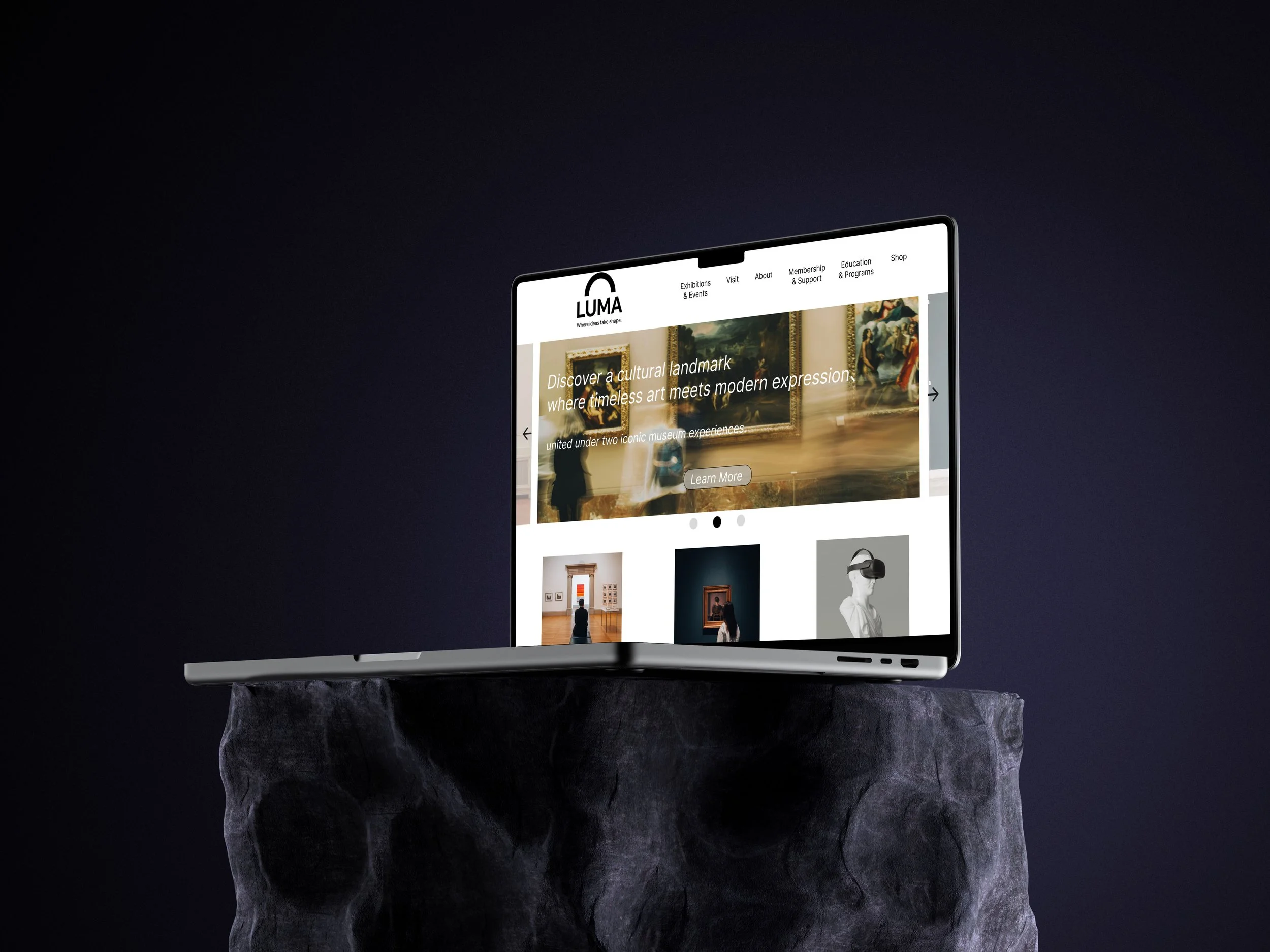
Information Architecture Overview
The navigation of the LUMA Museum website is designed to offer a clear and intuitive experience for a wide range of visitors. Whether users are planning a visit, exploring current exhibitions, joining educational programs, or supporting the museum, the site structure ensures content is easy to find and logically organized.
The main navigation includes the following core sections:
Exhibitions & Events
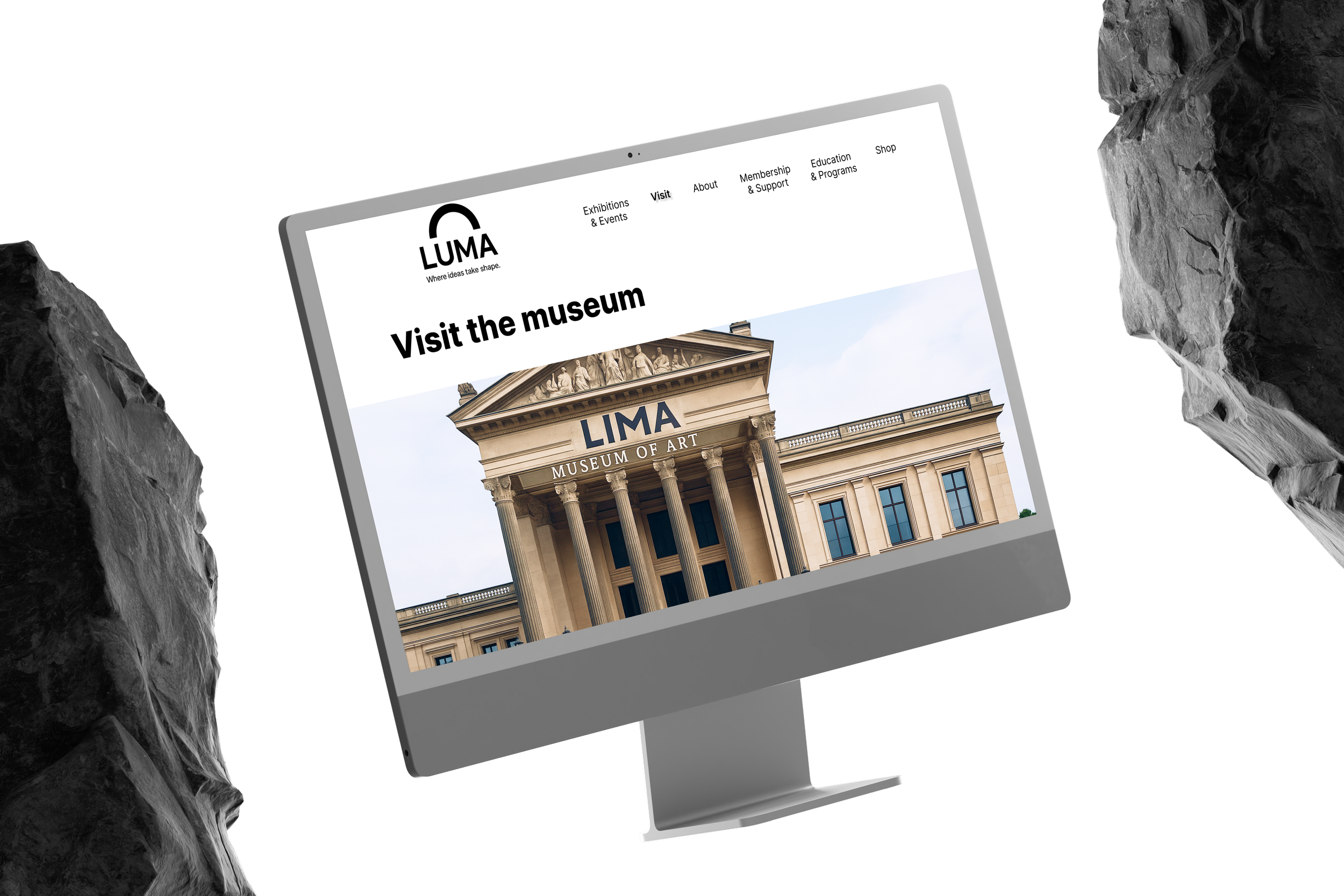
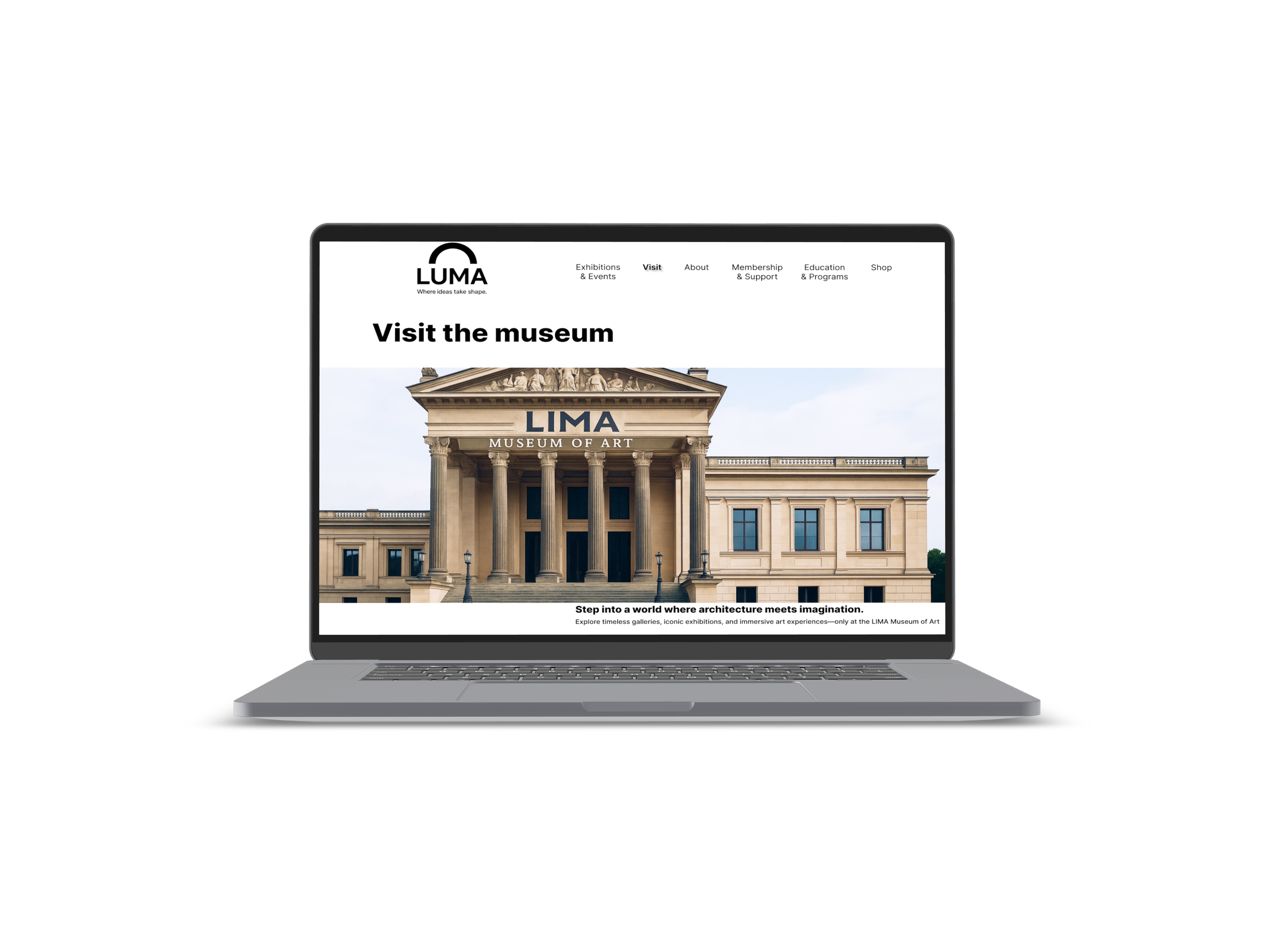
Features current, upcoming, and highlighted exhibitions, as well as special events and ongoing programs that invite public participation.Visit the Museum
Offers practical information such as planning a visit, viewing gallery highlights, and checking what’s currently on display.About
Shares the museum’s mission, history, and institutional values to help users understand its cultural and educational role.Membership & Support
Provides opportunities for engagement through memberships, donations, and corporate partnerships, with clear details about each program.Education & Programs
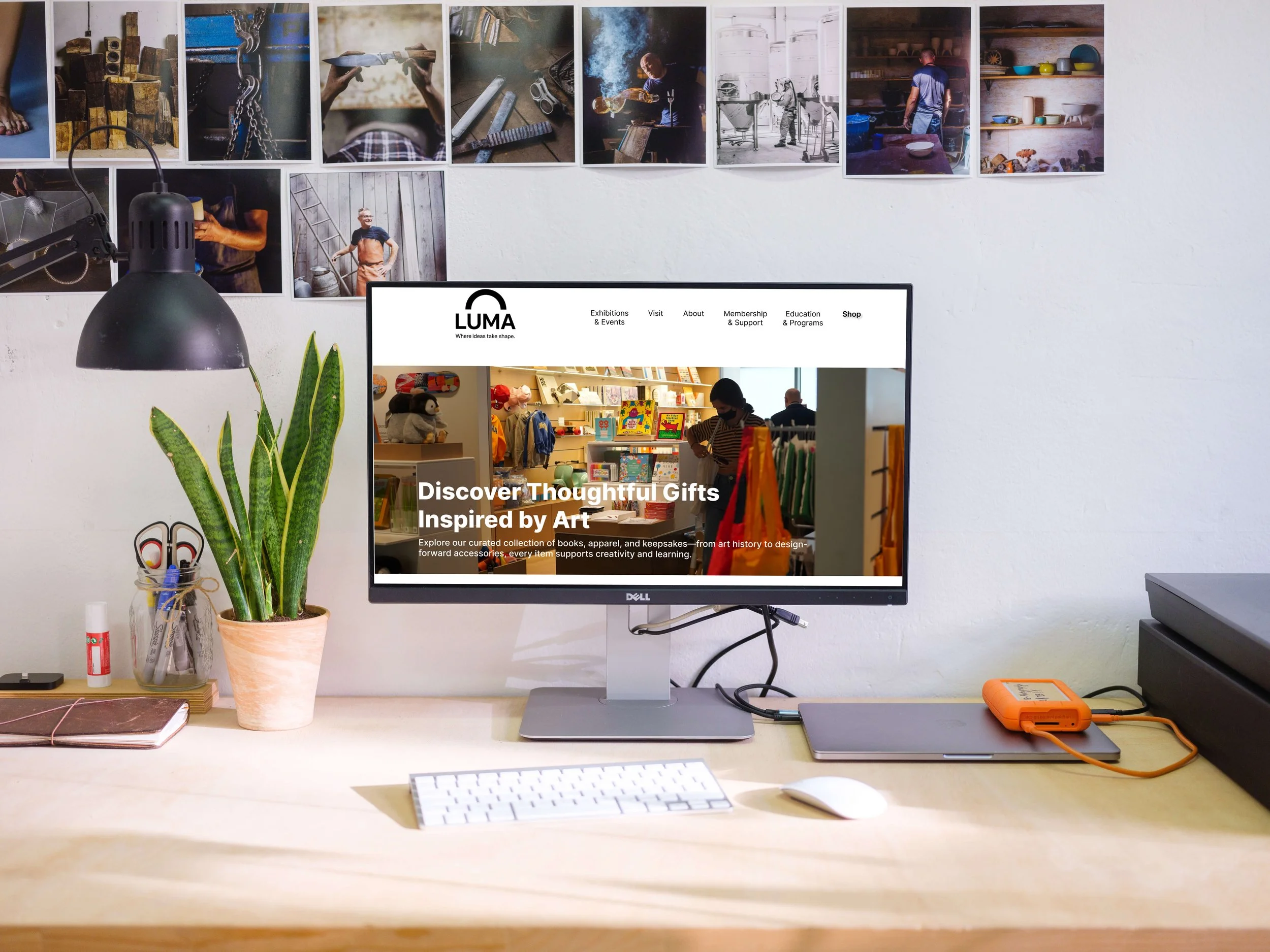
Dedicated to students, educators, and lifelong learners, this section showcases available programs, resources, and upcoming learning events.Shop
Curated products that reflect the museum’s creative vision, including art-inspired gifts, educational tools, and seasonal highlights.
This hierarchical structure was created to prioritize user needs while promoting discovery and engagement. Each section is broken down into focused subcategories to help visitors quickly locate relevant content without feeling overwhelmed.

Iteration
After defining the initial information architecture, I began refining the structure through multiple iterations to improve usability and clarity. Feedback from users and peer reviews highlighted several areas where the navigation could be simplified or better aligned with visitor expectations.
Key improvements included:
Clarifying Categories: I separated closely related sections like "Education" and "Programs" to reduce confusion and ensure that both educators and general learners could find tailored content.
Streamlining Labels: Menu items such as “Membership & Support” were adjusted to clearly reflect their purpose, combining community engagement and donation options in one place.
Balancing Depth and Breadth: Submenus were restructured to avoid overwhelming users with too many choices at once while still maintaining access to detailed content.
Improving Discoverability: High-traffic content like “Current Exhibitions” and “Plan Your Visit” were moved higher in the hierarchy to support users’ top goals.
These iterations helped transform the navigation into a more intuitive and goal-driven experience. The resulting structure supports both casual visitors and frequent users, making it easier to explore, learn, and engage with the museum’s offerings.


>
>
>


CHALLENGE 1
Overwhelming Navigation Options
During usability reviews, users reported feeling overwhelmed by the number of top-level categories. With six equally weighted tabs (Exhibitions, Visit, About, Membership, Education, and Shop), users had difficulty identifying where to start—especially if they were first-time visitors or had a specific goal in mind.
To resolve this, I explored grouping related sections (e.g., merging events into the visit flow) and prioritized high-intent actions like "Plan Your Visit" or "Current Exhibitions" closer to the homepage, reducing decision fatigue.
CHALLENGE 3
Educator-Specific Content Was Buried
Educators are one of the museum’s key user groups, but relevant resources were hidden deep within multiple submenus and repeated in different sections (e.g., both under “Education” and “Shop”).
To solve this, I created a clear, educator-centric path through the “Education & Programs” tab and consolidated content into a unified landing page tailored to this audience, improving both discoverability and relevance.
CHALLENGE 2
Lack of Visual Hierarchy in Content Layout
Although the sitemap covered all major categories, users found that subpages lacked strong visual hierarchy, making it hard to scan for information quickly—especially on pages with many text-heavy options like “Membership” or “Education.”
To address this, I redesigned key subpages using typographic contrast, icon cues, and collapsible sections to break down dense content and improve skimmability across devices.
CHALLENGE 4
Disconnected Shopping Experience
While the museum offers merchandise targeted at educators and creative visitors, the “Shop” section felt isolated from the rest of the user journey. There was little cross-linking between exhibitions and relevant products.
I addressed this by proposing contextual product links—for example, showcasing books or art prints from current exhibitions—thereby enriching the browsing experience and encouraging meaningful purchases.

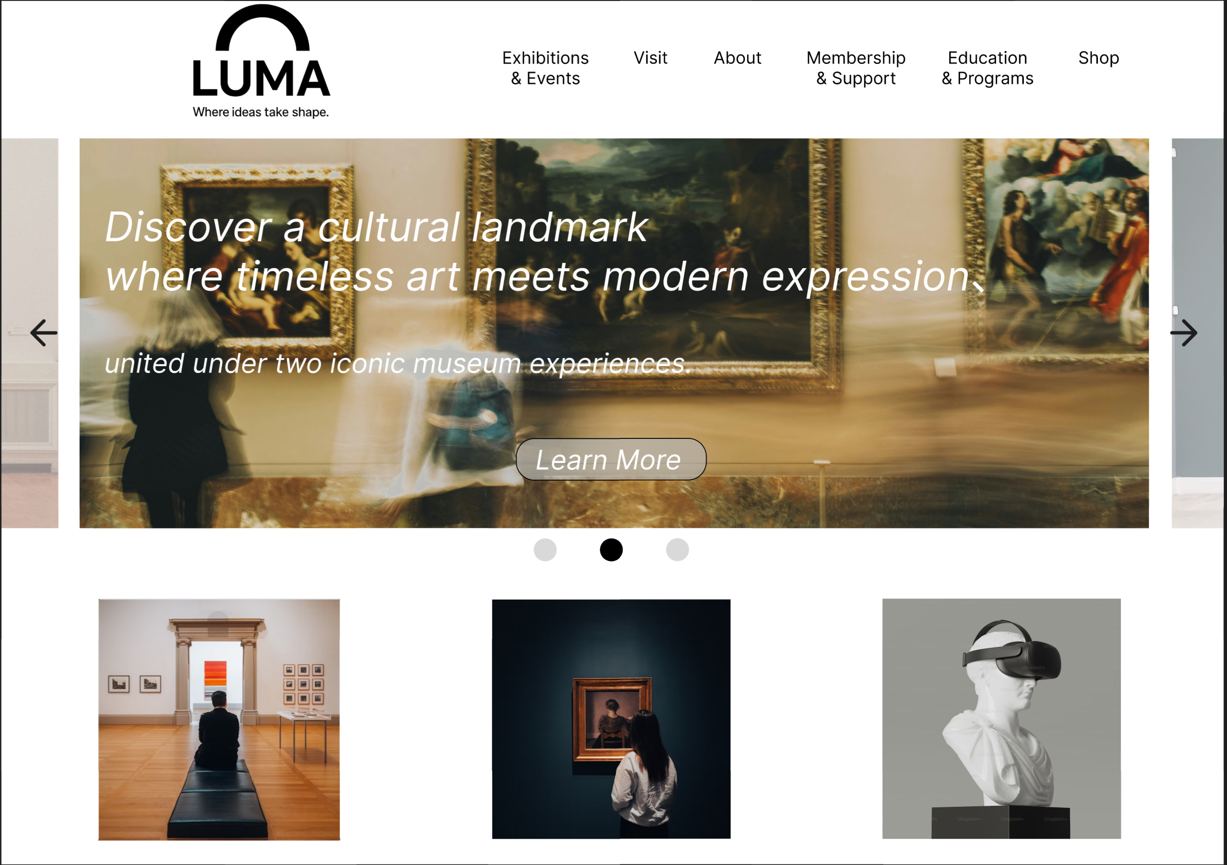
Style Guide
For the LUMA museum website, I aimed to create a visual system that feels modern, thoughtful, and culturally resonant—capturing the museum's mission of turning ideas into form.
The color palette is intentionally minimal, featuring soft lavender, neutral gray, and bold black. This restrained use of color ensures that the website’s design does not compete with the vivid, diverse colors of the museum’s artworks. By minimizing visual noise, the palette reduces color fatigue and helps visitors focus on the content itself—particularly important in an environment rich with visual expression.
The typography, Inter, is a clean, highly legible sans-serif typeface. A consistent hierarchy—from extra bold headers to subtle supporting text—allows for flexible yet coherent layout across different sections such as exhibitions, membership, and educational programs.
Buttons are designed with strong visual contrast and simple language to support intuitive interaction. Whether it’s joining as a member or browsing the shop, the calls-to-action are clear, accessible, and visually balanced within the interface.
The LUMA logo, featuring a bold arch, symbolizes emergence and creative formation. It anchors the design system while echoing the museum's theme of shaping abstract ideas into concrete experiences.
Together, these design decisions create a calm, intentional space that lets the art take center stage while guiding users through an elegant, accessible digital experience.


Takeaways
Designing the LUMA museum website taught me the importance of visual restraint when working in content-rich environments. With art and exhibitions as the focal point, the interface needed to support—not compete with—the creative works on display. This meant making deliberate choices in color, type, and layout to preserve clarity and reduce cognitive overload.
I also learned how thoughtful information architecture can simplify navigation across complex categories like exhibitions, education, and membership. Clear labeling, logical grouping, and consistent UI patterns proved essential for ensuring users could quickly find what they needed.
Finally, the project reinforced the value of designing with purpose: every element, from a button label to a background color, should serve the user’s journey and elevate the content it supports.